Building an Impact Assessment Assistant part 2: The UI and the UX
My team recently launched an internal chatbot for colleagues to locate information from impact assessments and impact assessment guidance in a natural-language interface. As a technical lead on the development of this project, this is the second of three blog posts taking a deeper dive on the technical path that led us to deployment.
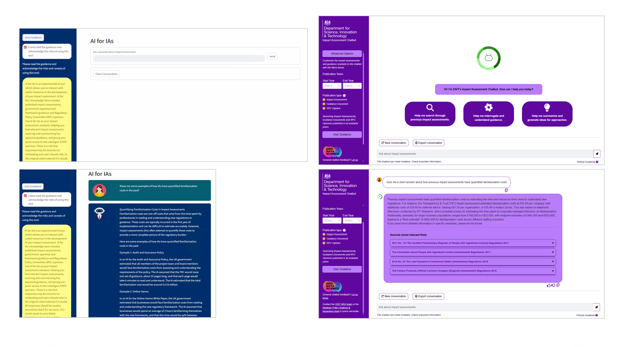
Left: screenshots of the UI in the POC Streamlit app, vs right: screenshots of our final product, which show how the design adheres to department colours, contrast accessibility and includes useful features like starting buttons and filters.
To develop a bespoke chatbot product for internal analysts, we weren’t just building the RAG logic – we had to build and test out an interface that worked for our core users.
We started out prototyping in Streamlit – however, this quickly became frustrating because of its limited flexibility when designing custom components.
For instance, we knew we would eventually want the ability to add buttons to each chatbot message - Streamlit’s UI framework for chatbot interfaces wouldn’t allow for this. We made the decision early to switch to Dash, which is built on Flask and offers a wider range of UI components, with the option to heavily style these, plus introduce your own elements. This has allowed us to build a very responsive UI that can also do things like, for instance, update from the landing splash buttons when the user asks their first question, replacing this with the conversational flow. However, there was no convenient pre-existing Dash chatbot framework (that is, containing elements like chat bubbles and scroll) to move to – so we made those from scratch. The interface contains a fair amount of subtle, but very useful functionality, each which required its own design and callback in Dash. For example, this includes attaching the ability to rate the chatbot’s response per-message with a thumbs up or down, which leads to a pre-populated Microsoft Form for the user to submit.
We selected Dash because it was a framework that we were more familiar with (at the time), i.e. still in the Python universe, as opposed to switching to JavaScript for a fully customisable interface. Having now worked with both JavaScript and Python frameworks for front end development, I broadly stand by this decision – Dash simplifies the development process when you’re also using Python elsewhere anyway (i.e. for RAG), we didn’t need the flexibility to design for multiple screen sizes and experiences, and it’s still interfacing with JavaScript, HTML and CSS so that you can customise whilst mostly leaning on pre-defined components (like those for pop-outs or buttons).
This said, I would not repeat using Faculty’s bootstrap components for Dash – these were the only parts of the framework that failed accessibility checks and required some hack-arounds to get working the way we wanted. We conducted in-house accessibility testing via our user testing and with browser tools like Lighthouse and WAVE, which allow us to check for non-WCAG 2.2 compliance. Using these tools we made sure that elements met contrast and labelling requirements for screen readers on desktop.
The UI is built using CSS to style and structure the application’s visual elements. The focus was on creating a clean, responsive design. The user interface (UI) was designed with simplicity and accessibility in mind, ensuring that DSIT analysts, regardless of technical expertise, can easily interact with the chatbot. We employed intuitive elements that users would be familiar with from interacting with other similar products, namely a clean conversation flow. This involved coding from scratch some surprisingly tricky elements, including getting the speech bubbles from the user and the bot to flow in the ‘right’ direction (i.e. from bottom to top of the container div).
Iterating from the proof-of-concept, we provided other features to make this bot user friendly. For instance, when landing on a page for a first time, it’s nice to provide examples of how to use the site – we did this by adding in buttons to the splash page that would start the conversation for you with the bot and simultaneously focus the conversation history. We added implicit features to prevent undesirable behaviour too – for instance, when the chatbot is processing a user request, we don’t want users to be able to enter any more input, as this would confuse the back-end, but we also want to show to the user that the interface is doing something and processing their previous input – therefore, we included an elipses animation whilst the chatbot was working to produce an answer. One other required feature was the ability to ‘save’ a conversation. This can be achieved in multiple ways – one is by enabling a user to see previous conversations in their interface. However, this requires users to be differentiated with logins, and a database to store those conversations in – for scope, data handling and cost reasons, we didn’t want to implement this solution. Instead, we provided the functionality for users to save their own conversations (and therefore stay in control of their data) whilst only retaining the current conversation history in the browser – and the ‘export conversation’ button was born. Getting this to output in the most useful format, a docx file, was also a user requirement that was trickier than one would have guessed to implement.
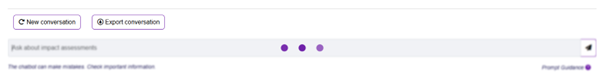
Whilst thinking, the input box is blurred and the ellipses animation runs to prevent further input and show the user something is happening.
The UI is tailored to meet the needs of internal analysts, ensuring accessibility for non-technical users. Throughout the interface, we employ design principles that many think of as implicit (until they’re missing) - for instance, clearly differentiating the design of a button and the design of an informational box, to show what is clickable and what is not, which is important (for example) for our splash-page buttons to get users started.
Finally, we used an intermediary layer, a chatbot manager class, to interface between the responsive UI elements and the Langchain framework – this means that the user gets a smooth experience when typing a message and sending it and then seeing the chatbot’s response. New messages require new active components to be created on the fly and then be persistent, including context, so this manager layer is necessary to keep track of the history separate to the Langchain message history (which by default does not record the context for historic messages, only the current message). That required understanding in detail how Langchain’s own class chat class worked, in order to interface - this was one of the challenges that illustrates how entwined designing UI is with designing a good backend context for it to work in.